
Easy paint upgrades that elevate an entryway
Help me choose which one to execute

I’m seeing a lot of reels going around Instagram right now about the power of paint. And not to be like, I was first to that trend, but five years ago I transformed every room in my 600 sq. ft. apartment in Boston with paint: the most renter-friendly of upgrades.
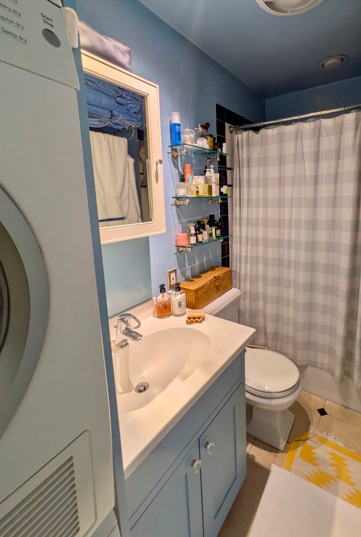
This teensy bathroom was impossible to photograph well (and I could have done a better job of tidying before whipping out the camera…) but I drenched it in high-gloss Farrow & Ball Lulworth Blue because I was really into the idea of making it feel like a swimming pool when you were in the shower. You’ll just ahve to take my word for it that standing in there, the light reflects off the gloss and it kind of works!
Since my entry in Chicago is finally meeting our needs for functionality and order (for the most part), I can now step back and clearly see a few areas where I’d like to add texture and interest. I just can’t choose between them. I need you guys to vote and help me decide!!
I don’t know about you, but I have the easiest time noticing where I want to add layers when I examine a photo of the space.
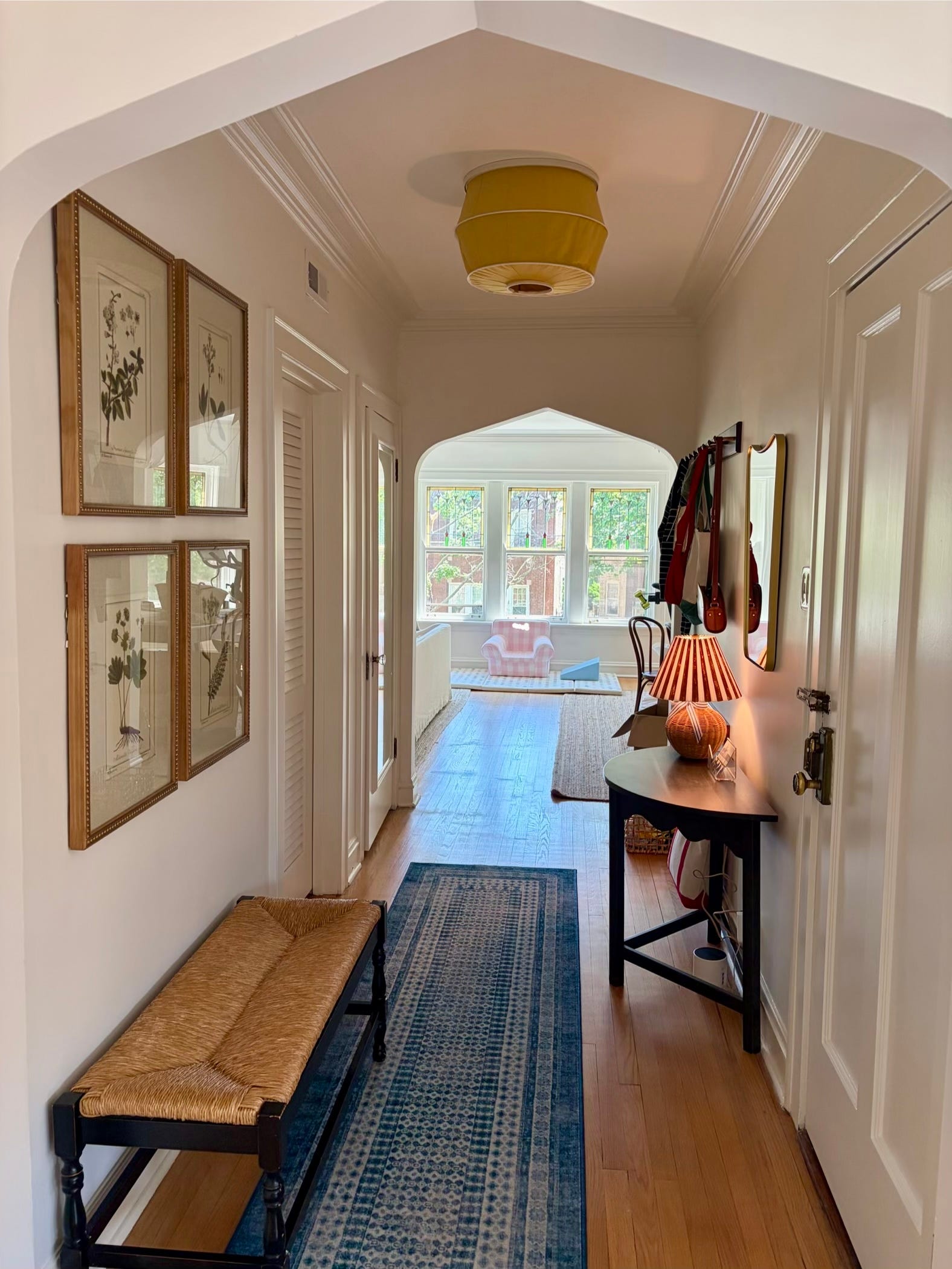
Here’s my entryway. All white paint, but so much architectural detail. The mouldings, the baseboards, the paneled front door, the slats on the bedroom door, the matching arches on either side. Even the framed ceiling. I could choose one or two of these areas to draw a focal point to, but not all.
So here are my options.
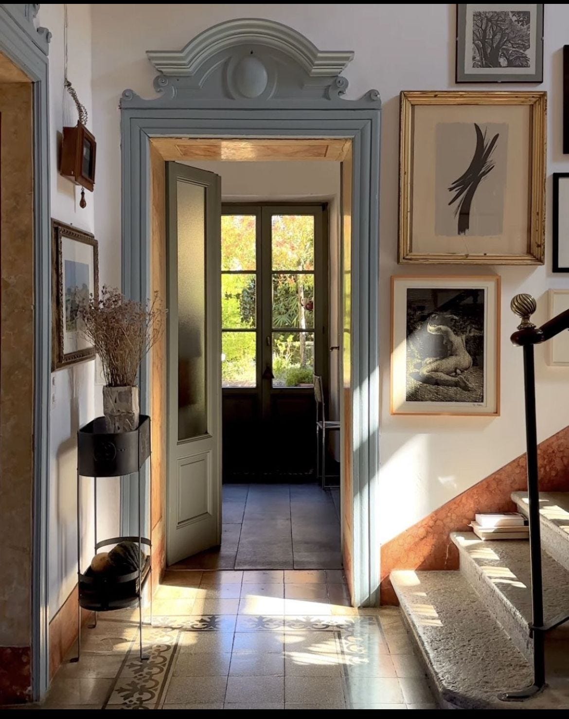
1. The arches
Making a doorframe pop beautifully frames the line of sight while defining each individual space, when you have a long series of rooms lined up. Using other design elements in a complementary color to the doorframe (in this case, rugs, a pot, and a chair with brown/red tones) makes it pop even more. And the tiny details of the lampshade and throw blanket in a similar shade to the doorframe bring the focal point into a larger story, rather than being a color that’s used only once.
The more I look at this space, the more I see and the more I love it.
Sidenote: I would love to get my hands on the floral art in this photo.
In my room, the arch framing would be much more subtle because there isn’t moulding around them. I would paint the underside, so the amount of attention they drew would change based on where you were standing.
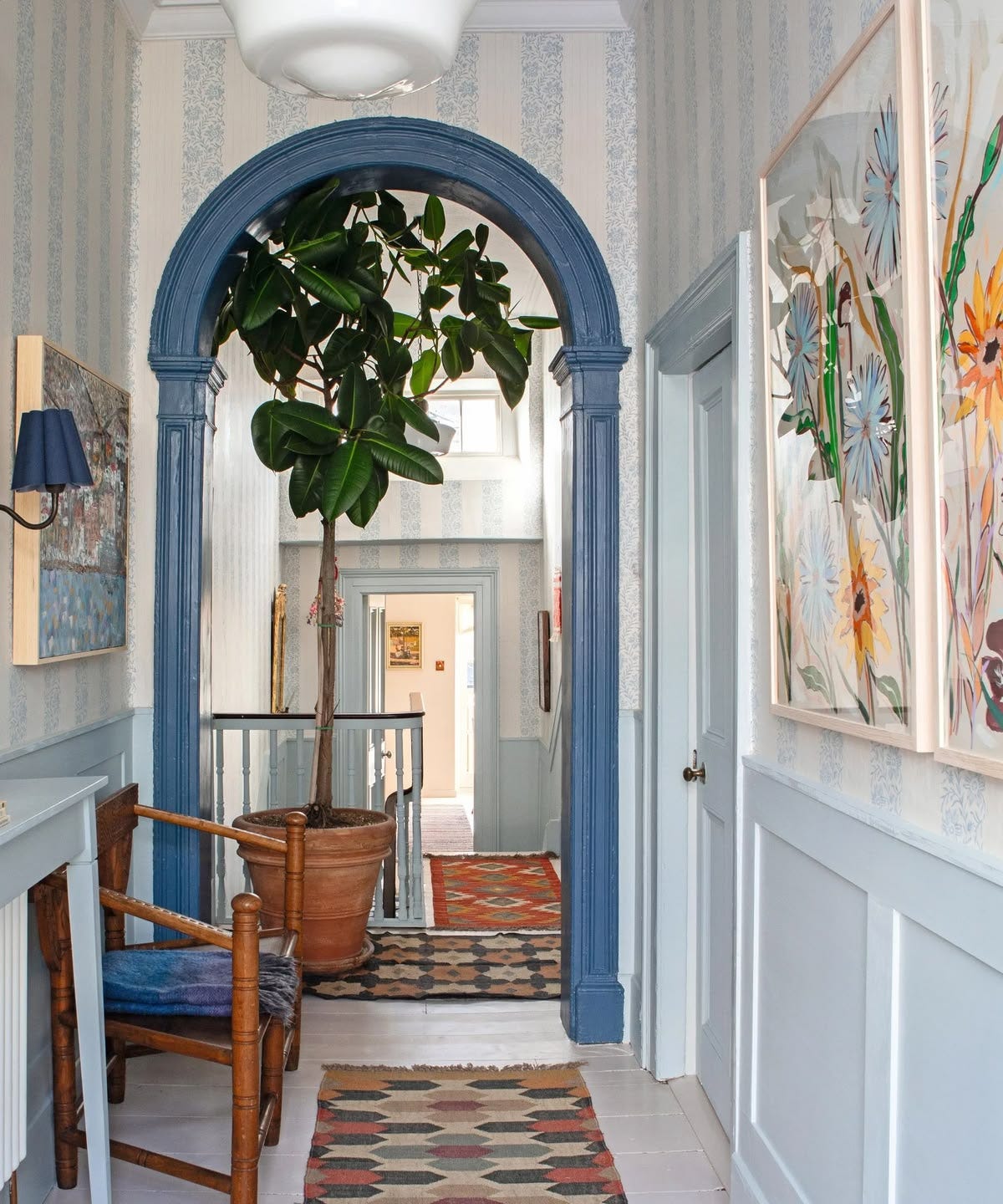
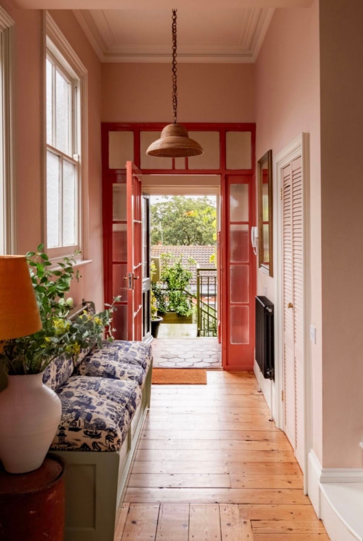
2. The doorframes / mouldings
Everything I said about the arches applies here, except that you don’t have to factor in line of sight as much when you have a door that closes. So, you paint the frame and the door. Your choice whether or not to wrap in the baseboards, crown mouldings and other woodwork.
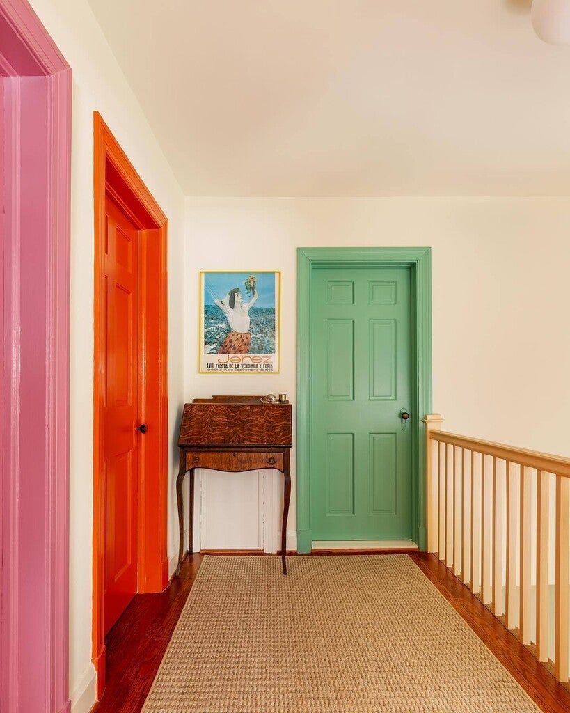
In one of my favorite hallway images circulating, multiple doors in multiple colors can be the exact shot in the arm a space needs.
While you’re painting your doorframe, pop a corniche above it to add texture and elevate your design. Obviously, be sure to paint the corniche.
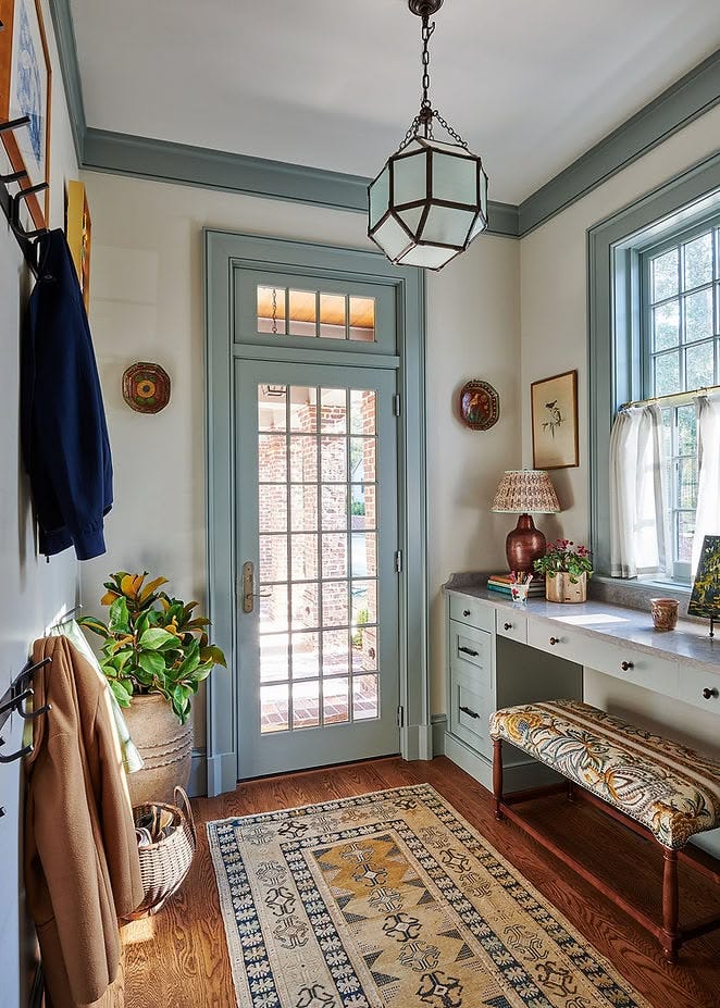
3. The ceiling
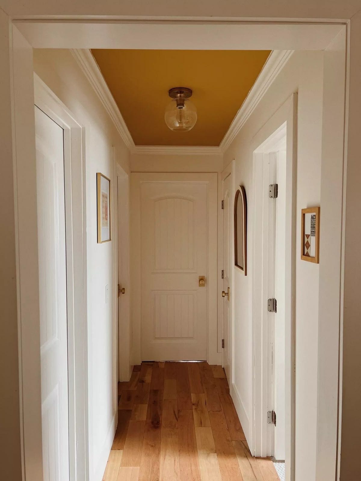
With an exception for the neck craning part, this project would be so easy! A painted ceiling makes an already small space feel intentionally cozy and cocooning, and I love the addition of a glass ceiling fixture that takes on the hue of the paint even when the light is off. The appeal of this space is in the complementary tones—the brass hardware and warm wood—as opposed to its contrasts.
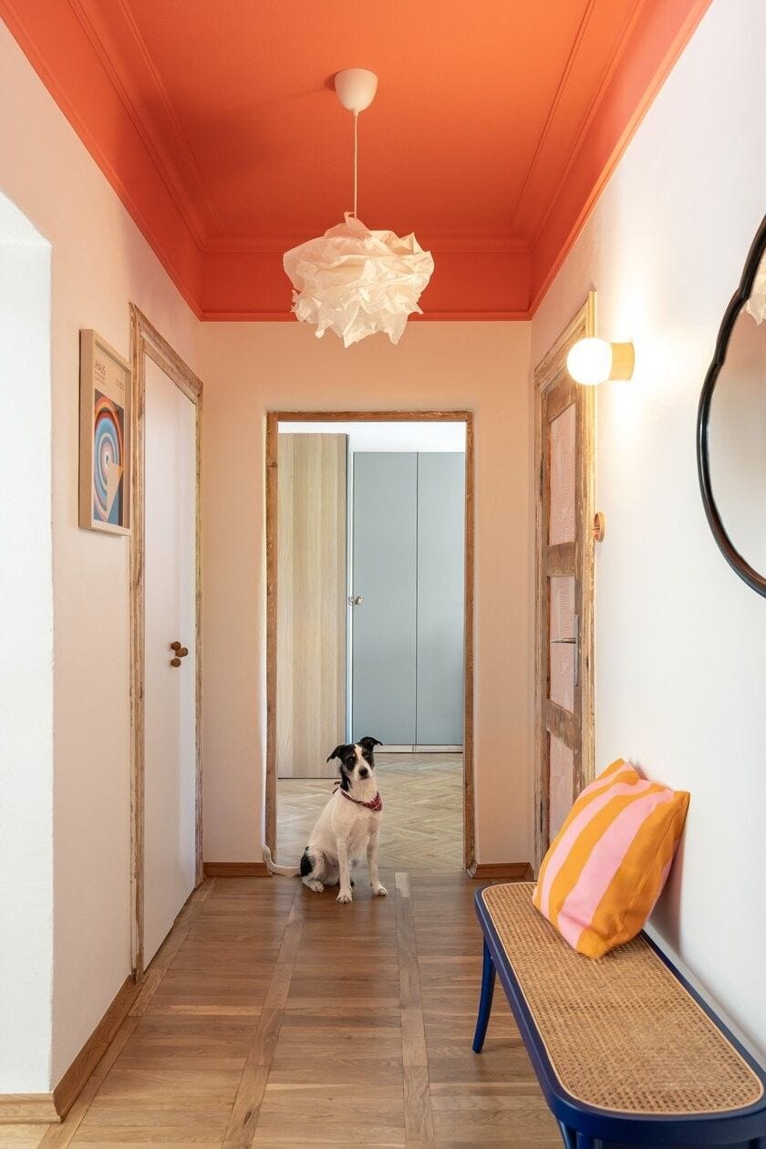
Wrapping the ceiling paint down over the mouldings is also a gorgeous choice, depending on your architecture and other design elements.
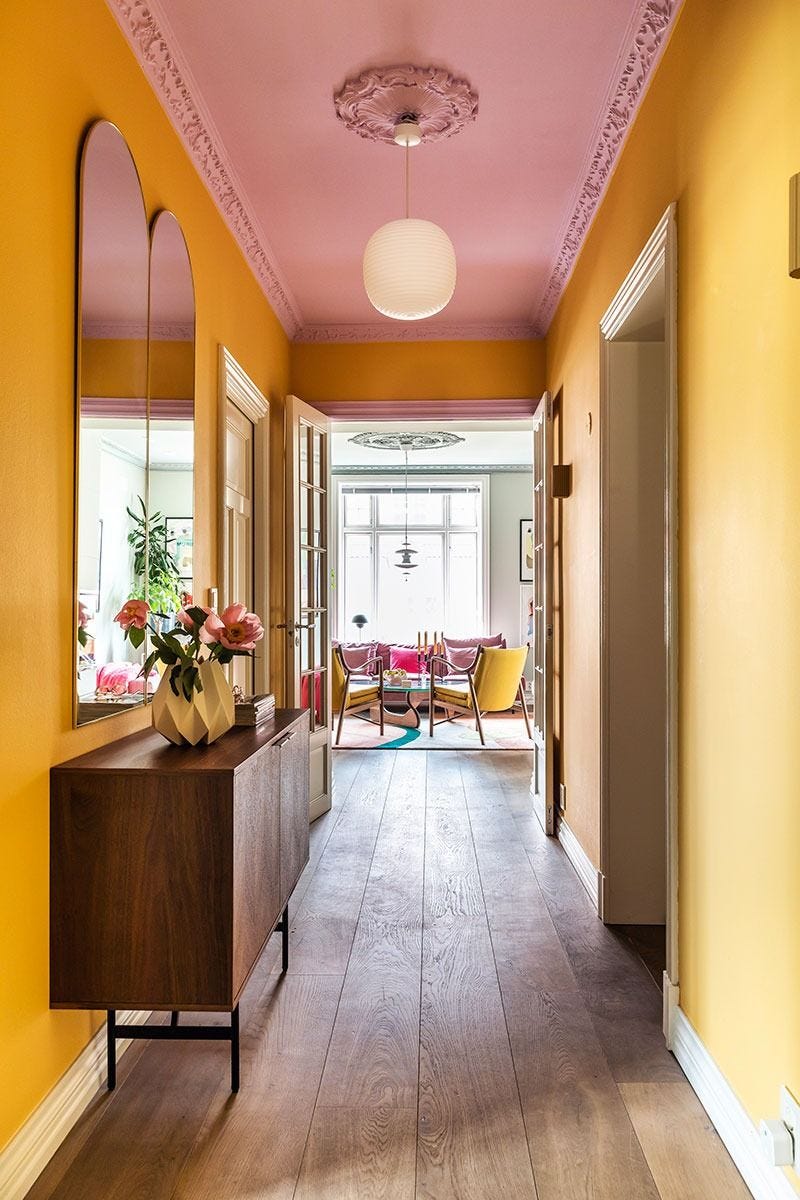
4. The good old-fashioned walls
One design trick I love is painting the walls a color but leaving the trim white! This space uses that to beautiful effect, adding a punchy focal point on that beautiful glass door.
Anyway, my bathroom at the beginning is not a shining example of this, but it’s one I’ve played with in the past, and I’m excited to have more opportunites to make a better impact on my current home’s design.
What’s your vote: 1, 2, 3, or 4? Or some combo, or something else entirely that I haven’t thought of? And what color paint would you add?
Looking forward to hearing your thoughts! Have a great weekend!
xx Jane
P.S. Sincere apologies for missing the newsletter last week, I was traveling solo with my toddler.
I love your entry/hall space! I vote for #3, the photo with the painted ceiling, warm tones, warm wood floor, and brass hardware. Whatever you do, it's always wonderful!
I love this, Jane! I intentionally painted the walls in my personal office an off-white and the trim a rich blue to mark it as a "private" space--other rooms for work were colored walls/white trim. I think the contrast is a great way to indicate the mood of a room as well. I vote #1!