
Space planning a room
Space planning a room
With examples from my house in France

Hello and welcome to this week’s edition of The Bell!
One of my lovely subscribers asked if I would write a newsletter about how I plan and conceptualize a room to decorate it. She finds the details easy but has trouble seeing the big picture.
I can relate! It can be really hard to visualize how new furniture purchases are going to fit together with what I already own, in a room that looks cohesive and functions as intended.
So, I’ve documented my space planning process below. Curious to know how you guys go about this process—let me know in the comments!
Start by listening to the room.
Often, a room will tell you what kind of space it wants to be, not just in terms of function, but in terms of feeling. A great room with high ceilings wants to feel spacious and airy. A finished basement wants to feel cozy and enveloping.
Pay attention to the architecture of the room and the location in the house; it’s difficult to feel hugged by a room if it’s a huge open concept—possible, but a much harder design task. Higher rooms like upstairs bedrooms and attics tend to be places to dream and use your imagination, while lower places like basements tend to be places to curl up and feel warm and protected.
Consider the light at different times of day; does it naturally have cheerful sunlight or moody shadows? Try to work with the room and the vibe it naturally leans toward.
Work on function and beauty side by side.
I don’t lead with either functionality or aesthetics when designing a room; I consider both at the same time. Only pretty and it won’t be usable (see most houses photographed in The World of Interiors, lol). Only functional and it won’t have a soul.
Parameters are your friend.
The best creativity arises from constraints. I remember seeing the home of a very wealthy woman photographed in Architectural Digest and thinking it was clearly beautiful but… somehow bland and boring. I believe that the most difficult place to design from is a blank sheet of paper and unlimited resources. There has to be something to work around: long and narrow shape of the room, inconvenient placement of windows, tight budget, low ceilings, not enough closets, etc.
Those problems are annoying, but solving for them, you’ll come up with your most ingenious design solutions. I remind myself of this constantly!
Trust what your eye really likes.
When you see an image you love for the room you’re designing, flag it and make a mood board. I suggest actually making a mood board so you can see all the images overlapping together, as opposed to, say, a Pinterest board, saved folder on Instagram, or file of sheets you’ve torn out of magazines where you have to flip through many disparate images.
Like, cut out the specific element that inspires you (it doesn’t have to be an interior, it can be a lifestyle image that conveys the same vibe (i.e. breezy, urban, playful, etc.) and paste it together in a collage with the other elements that inspire you.
I am exclusively guided by what my eye really likes in this exercise. It’s no use trying to be edgier than I am or pretending to be inspired by something I’m not. No one has to live in the space but you (and your family), so you should design it for your specific taste and fill it with things you love.
You can make a mood board on Canva or Spoak. More on Spoak below.

But… question the photos on Instagram and Pinterest.
Sometimes a room looks amazing in a photograph, but upon reflection, you realize you could never realistically live in the space. Maybe it would only look good when spotlessly clean. Maybe the colors are too strong and bright.
For a bedroom or bathroom, my mom says to imagine being in the room when you have the stomach flu. Not a fun thought exercise, but it gives you the information you need! Your house should hold you at your best and your worst.
So, be honest about how you really live. Do you tidy every day? Do you have cleaning help? Where do the kids spend the most time? Where do you get your work done? Do you entertain a lot or just aspire to? Do you allow your pets on the furniture? Do you feel psychologically best and most held in a more minimalist or maximalist environment? (And is that different from what you usually like in photos?)
It’s always best to adjust the house to you and your reality, not try to adjust yourself and your family to the house to fit some fantasy. Because the latter will never work and will make everyone miserable.
Sketch it out.
Okay, now you’re ready to actually start space planning!
Use pencil and paper or software to play with your floor plan and elevations. (Elevations are what each wall of the room will look like, floor to ceiling. Aka the vertical “floor” plans.)
I like Spoak for this too because it’s an interior design software inclusive enough for amateurs to use—aka you don’t have to go to design school or invest a bunch of hours to learn your way around it.
The sketching step allows you to play with function (especially important in kitchens and bathrooms), measure to see what furniture will fit where and make sure you have wide enough paths to walk around / push out dining chairs, and move things around without having to physically push heavy furniture around / close your eyes and picture it.
And of course, it lets you play with aesthetics, too. Where you want symmetry, where you want playfulness, where you want something surprising or offbeat. You can drop actual pictures of products (and exact colors and patterns) into Spoak and watch your room come to life. As Swedish designer Beata Heuman says, “Every room should sing.” Think of space planning as composing the song.
To get very nitty gritty about how I do this…
I start with the piece of furniture that can really only go in one place. This parameter usually exists. In a bedroom, there’s usually one place where the bed fits best without covering windows, leaving room for bedside tables on both sides.
Ideally, I like the door to the room and the headboard to be on opposite walls, or at least on a wall perpendicular to the door. That flow just feels better to me than the door and the headboard being on the same wall. My explanation: the bed is the centerpiece of the bedroom. I think the centerpiece of the room should be the primary thing you see from the door when you walk into the room. In a living room, it’s usually the fireplace. In a kitchen, it’s the range. In a bathroom, it’s the bathtub. In an office, it’s the desk. Etc. This isn’t always possible, as I said, because often there’s only one wall in the bedroom where the bed can go.
I broke my own rule at our house in France and put our headboard against the same wall as the door into the room because that’s the only place it would go. The second wall has a window and radiator in the middle. The third wall (opposite the headboard wall) has a fireplace in the middle. And the fourth has a window in the corner, but needs space for door clearance in the other corner, so ultimately no room for a bed in between.
It’s not ideal! But there is a fireplace on the wall opposite the bed, which makes a nice centerpiece, and a bed facing a fireplace is deeply cozy.
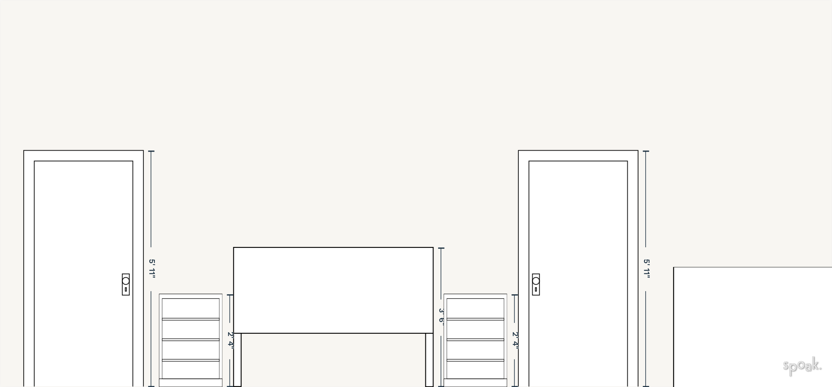
If that made no sense, here’s a picture from when we were just starting to put furniture in.

After we put in the bed, the rest of the space planning puzzle pieces started to fall into place. A major parameter of our French house is that there are no closets. None. So clothing storage rose to the next top priority: we needed at least one armoire.
The walls large enough for an armoire, and without door clearance, were on the third wall to the left of the fireplace, and on the fourth wall to the right of the window.

With sleeping and getting dressed sorted, the next priority was somewhere to work since our house is kind of under construction and the bedroom is the only zen space where we can get computer work done. It’s nice to have a desk facing a window, so that’s where I put it. It’s out of the way of the door clearance of both the main door and the armoire doors. (And low enough that the French window clears it, since the two halves open to the inside. So much clearance to worry about!)
Finally, we plugged in some lamps and hung some art.
I’m not saying this is the most beautifully designed room ever; it’s very much a work in progress and my focus was on making it serviceable as quickly as possible. It needs a fresh coat of paint or wallpaper, the floors need properly sanded and finished, the windows need curtains, the rugs need switched out for better-fitting, more permanent solutions. And it needs a comfortable chair and ottoman, perhaps to the right of the fireplace, to sit and read.
We might even get a new bed. All the individual pieces of furniture can be swapped out (except the armoires; those are incredibly hard to move, lol) but the space planning will essentially stay the same now.
I threw together the elevations of the four walls to give you a visual; Joseph and other professional designer friends, if you’re reading this, don’t laugh. The listed dimensions mean nothing; ignore them.


So that’s the bedroom in France!
To quickly run through the space planning decisions in my living/dining room in Boston, the biggest parameter, the “thing that couldn’t go anywhere else” was that the dining table and chairs had to be in front of the windows, by the kitchen. (Being able to seat 6 people for dinner in my tiny space was a high priority, and there was only one place with the chair clearance to make that possible, if still tight.) The next priority was the baker’s rack, which could either go to the left or right of the fireplace. Since I was going to use it to store dishes and cookbooks, the right of the fireplace made the most sense. Then, a sofa facing the fireplace made sense, with a coffee table between. Next, the chest of drawers could either go to the left of the fireplace or the perpendicular short wall. I have tried both spots and ultimately decided the room feels more balanced and larger to me with it on the perpendicular wall. Check out this post to see visuals, and the evolution from move-in.
I think that’s all I have to say on the subject today! This obviously stops short of actually decorating a room: no choices about color, texture, material, pattern, etc. come up in the space planning step. But the intention was to keep it big picture, so hopefully I achieved that.
Let me know… was this helpful? Do you go about space planning differently?
xx Jane